We all know that donation forms are very, very important. They’re the end all and be all when it comes to your donor experience. So, once a donor has landed on your donation form, you want to make the giving experience effortless. You want form optimization to the nth degree: a form that's readable and beautiful and intuitive and must-clickable. Donors enter their email address, check a few boxes, enter those payment details, and bam: donated!
But if we want donors to have a great giving experience, why do so many nonprofits and organizations still use single-step forms over multi-step ones? That is the question we’re here to address.
And in case you hadn’t heard: Funraise uses multiple-step donation forms, and they have a 50% conversion rate. You read that right: every other donor that lands on a Funraise client’s donation form donates. Talk about a high return on your effort!
Multi-step vs. single-step forms
First things first: what’s the big difference between these two types of forms?
A single-step (or single-page) form is all on one page, and you answer all the questions at once. You don't have to click on any "next" buttons or go to different pages.
With a multi-step (or multi-page) form, instead of answering all the questions at once, you go through it step-by-step. For this type of form, each step usually focuses on a specific set of questions or information, and you move through those steps one at a time. Businesses use multi-step forms for everything from signup forms and checkout forms to shipping forms and demo booking forms. But as a nonprofit, we're keeping the focus on donation forms (the best of all forms, in our humble opinion).
Why use multi-step forms?
So, why are we firmly on team #multipageform? Easy. A bunch of studies have shown that, for more complex forms, a form design with multiple steps leads to an increase in conversions. Check it out:
GoodUI tested a form with multiple steps versus one with everything in one place for Obama’s campaign website and saw a 5% increase in revenue.
And, in a recent A/B test, Blackbaud compared a single form to a multi-step donation form. They found that multi-page forms led to:
- 33% more total conversions
- 75% higher form conversion rate (conversions per visit)
- 90% more overall donations
- 54% higher average donation
Those are some pretty impressive results, if you ask us.
Benefits of using a multi-step online form
Having established that forms with multiple steps are key to conversion rate optimization, let's turn to the (many) other benefits. And BTW, this isn’t just Funraise trying to sell you on some newfangled feature—this is a best practice endorsed by W3, the people who set web standards.
They’re mobile-friendly.
We’ve all been there: you just want to find a decent recipe for strawberry muffins on your phone, only to enter an endless tunnel of content that Just. Keeps. Going. That’s how single forms work on mobile devices—you get the entire form in one go, and if there are more than 3-5 fields, it's a lot. But multiple-step forms provide a smooth user experience, with just the right number of form fields per page.
Increase accessibility.
For folks who have less experience with computers and those who have various cognitive disabilities, facing a wall of fields all pressing for answers can range from anxiety-inducing to downright impossible. Multi-step forms aren’t just an accessibility consideration; they benefit everyone.
They're better visually.
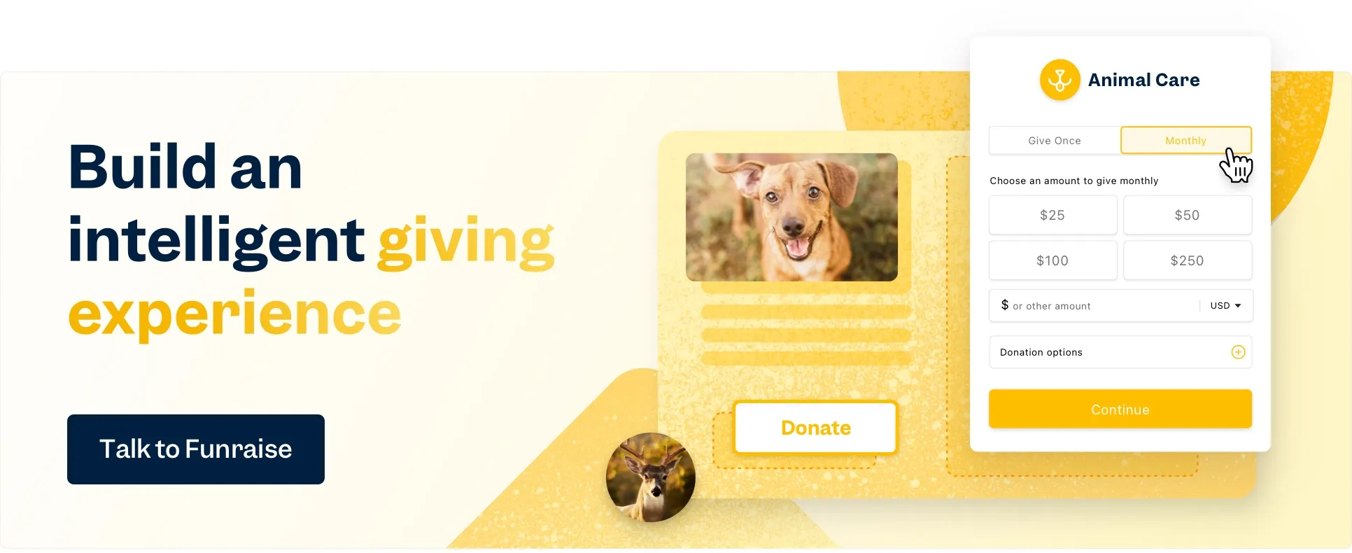
TBH, a traditional form just isn't that pretty to look at. It's so much text, and we're all about that clean design with plenty o' blank space (as seen in Funraise's customizable pop-up donation forms). In the end, when it comes to visually appealing forms, a 4-field version is just easier on the eyes than an 11-field version.
Reduce cognitive overload.
Single-page forms have soooo much text that it can result in some hardcore psychological friction, also known as brain drain. Donors think, "When will it ever end?!" Separate steps, on the other hand, break everything down into bite-sized nuggets, leading to a more engaging experience and a higher completion rate.
Say bye to form abandonment.
Faced with a lengthy one-page form with lots of text and fields, many donors will peace out before completing the checkout process. But with multiple steps and quick actions, they'll click on through, and that means your form abandonment rate will go down, down, down. (And if you want even lower abandonment rates, use Funraise donation forms to gently nudge visitors to complete their donation with a one-click pop-up at the bottom of your website!)
More options = big gains.
Because forms with a multi-step process are so much easier to navigate, you can go beyond the basic fields without taking up too much valuable page real estate. Let donors check a box for a matching gift, dedicate or allocate their donation, or up their giving frequency to monthly! You'll still have white space to spare.
When to use a single-step form instead
So, we agree that multi-step forms are the tops. But sometimes, you’ll want to stick with a one-step form. If you have a single-field form or just a few form fields, it doesn't make sense to spread it across multiple pages. Here a few examples of minimal-effort single-part forms:
- Simple contact form
- Email newsletter sign-up form
- Support form
- Customer feedback form
These types of forms require so little effort that there's no need for additional details. In these cases, a one-step form will get the job done, so go ahead and display everything in one place with a single action button. The user can type their name and/or email address, hit that submit button, and move on with their life!
Again, for more complex forms with additional fields or more than 1-2 questions, multi-step is the way to go. Here's looking at you, donation forms.
Tips to build the best multi-step forms
While we love a form with a multi-step flow, not all of them are created equal. For successful multi-step forms, follow our guidance below—guidance that Funraise follows in our high-converting, user-friendly donation forms.
Group similar questions together.
If you want folks to move through your form quickly, organize your questions intuitively, grouping similar items and relevant questions together. So, for a fairly simple donation form, that might mean asking for essential details first, like amount and frequency. Then, users fill in their donation details and preferences, followed by their contact details, and finally, their credit card details or other payment information.
For lengthy forms, include a progress bar.
If you have a whole lot of stages, may we suggest a progress bar? This isn't necessary on most donation forms, but if you're doing a lengthy survey or event signup with pages of multiple-choice questions, some form of progress indicator will ensure users don't get burned out on all those clicks, leading to (gasp!) form abandonment.
Don't go overboard.
Multi-page forms break everything down into nice, doable chunks, but that doesn't mean you should include 46 different pages. Every additional click means some donors will leave, so we always advocate for shorter forms (which means more form conversions!) to avoid overwhelming visitors.
Let users go back.
If you want a great user experience, let your donors go back to previous steps. Just as we all appreciate the opportunity to unsend a Gmail for 30 seconds (there's always a typo!), give your donors the grace to go back to the previous question and adjust their previous answers.
Mark required fields.
An intuitive form-filling process is the name of the game, so let folks know when they need to fill in a certain field. By providing complete transparency in terms of what's necessary, you'll build trust and reduce frustration.
Use clear CTAs.
Clearly mark those "continue" and "submit" buttons; if there are additional form fields, say so. The goal is for your donors to know exactly what to expect.
Action Against Hunger shows that multi-step form examples work
Now, how about a little proof? When Action Against Hunger updated their website, they wanted to increase conversions rates by allowing the donor to make a donation from any page through pop-up donation forms. So, they did a little testing (okay, a lot of testing), adding Funraise's customizable, multi-step pop-up donation forms across their site. Here were the jaw-dropping results:
- Total combined (one-time and monthly) conversion rate saw a 78.4% increase
- One-time gift conversion rate increased by 88.2%
- Monthly gift conversion rate increased by 12.1%
- Total value (accounting for conversion rate and average gift) showed an increase of 23.3% for one-time gifts and 65.8% for monthly gifts
Convinced yet? If you're ready to take a multi-step leap toward better conversions and happier donors, we're here for ya with our user-friendly, super-charged online form builder.
Multi-step forms: Key takeaways
- A single-step form is a form where all the questions are on one page, and you answer them all at one time. With a multi-step form, you answer several sets of questions one at a time, clicking from one to the next.
- There are many reasons to use multi-step forms, but the main one is that forms with multiple steps lead to higher conversion rates.
- You’ll want to use single forms for the simplest forms, where you don’t need additional details.
- To ensure a successful multi-step form, follow best practices like grouping like questions altogether, mark required fields, and use clear CTAs.


.svg)


.webp)
.webp)

.webp)
.webp)
.webp)


